MobileApp
BIT Mobility
Enjoy the way
BIT mobility is a Mobile App available for iOS and Android that offers dock-free electric scooters rentals to fulfill short distance urban trips. in Italy, especially during the COVID-19 emergency, e-scooters are becoming largely used to avoid public transportation and reduce the chances of infection.
bit escooter mobile app iphone
Case summary

Product vision

In Italy BIT it’s also a new way to avoid the traffic of the city but often the user is either afraid to rent an e-scooter, or he finds himself confused by the procedure to follow, specially when he has no time to waste due to the job schedule or an appointment. The long term goal is to make possible the daily utilization of the scooters instead of public transport still giving a great experience to the “casual users”.

Challenges

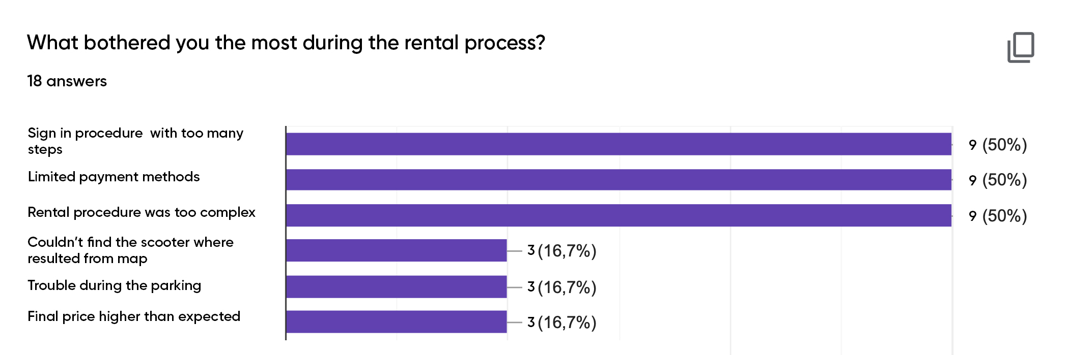
The two main challenges are:
- setting the research to understand what are the pain points, frictions, goals and expectations of the user.
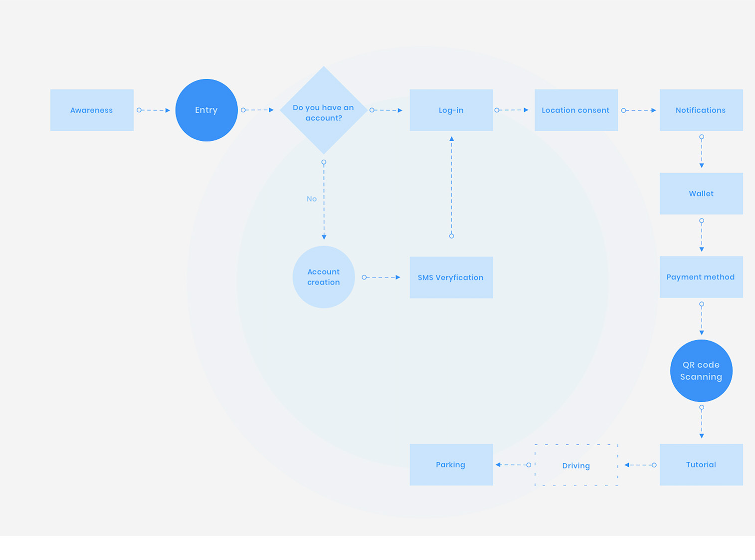
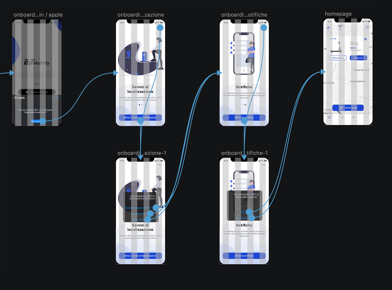
- reducing the gap between BIT and the user, enhancing the only “contact point” between them: the mobile app.

Outcomes

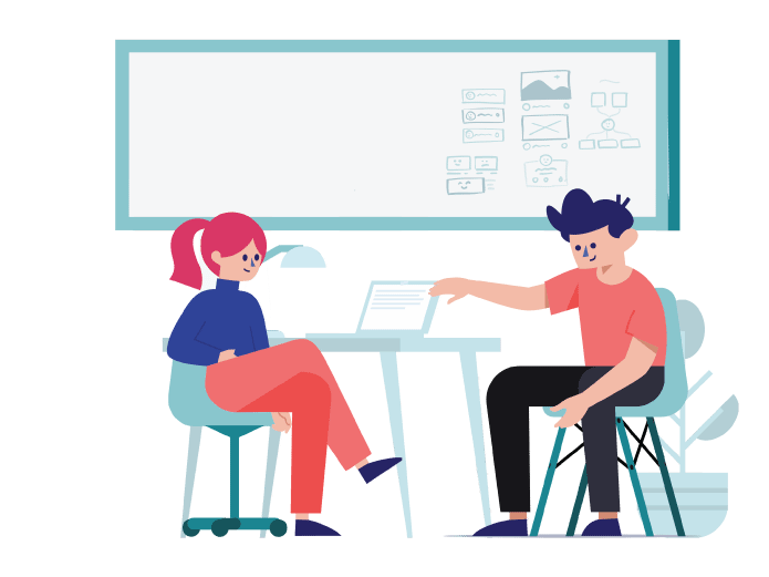
Based on the findings from both UX research and user testing sessions I were able to come up with a list of changes and new 
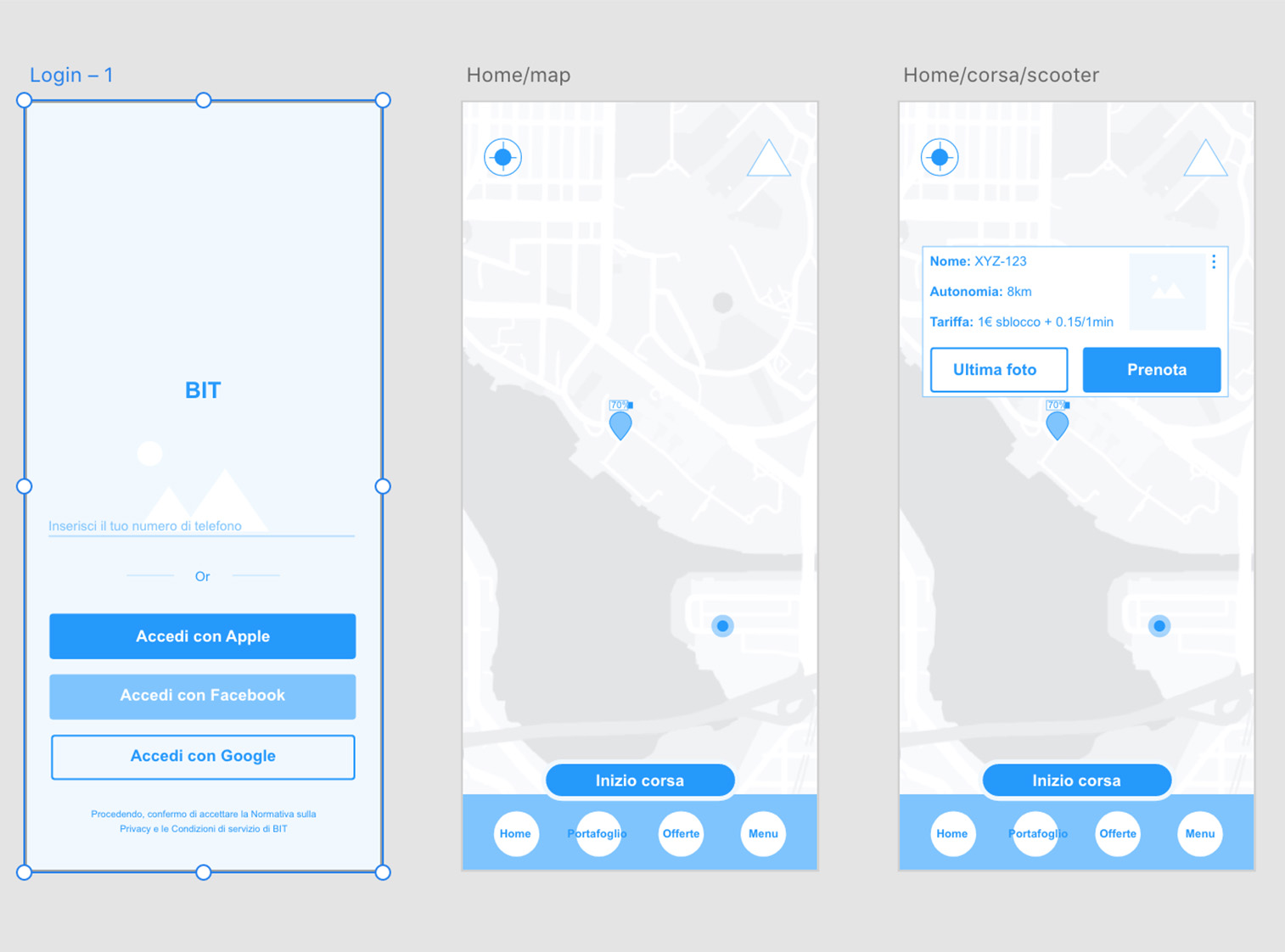
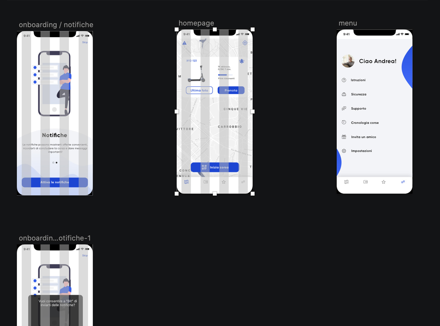
features. At this point has been necessary to design a new experience for the user and a new interface.

Process Highlights

1. Understanding the "what"

What is bit, how renting apps work, what’s the typical user.

2. Research / Analysis

A strong research and an accurate analysis is crucial to set a valid start point for the final design.

3. Emphatyzation

Basing on the research I created different users archetypes to better understands user's journey, flows and frictions.

4. Design process

Starting from the lo-fi wireframes I created the final prototype basing on the research made and the whole design system.

5. Analysis, again

The final prototype has been object of users testing and reviewed.
Research

“Give me six hours to chop down a tree and I will spend the first four sharpening the axe.” A. Lincoln.

The research is the foundation of the whole design so it requires a wide range of tools to identify problems and needs of the users. In this project I conducted user testing, surveys, interviews and read the reviews on the Apple store and Google play. Plus I made an accurate study of the competitors features and different onboarding procedures.

I conducted the surveys using Google Forms and 22 responses was collected. Surveys and interviews was useful to better understand who is the user and what are his goals and to gather the results of demographic and ethnographic research.

One of the many unexpected results was that a large number of the users give more importance to the procedure which brings them to rent the e-scooter and not to the physical usage of the scooter itself, due to the fact that nowadays the physical service has a high standard level between all the competitors. Limited Payment methods, long procedure to create an account and individuating the e-scooter are just some of the problems emerged.

A survey made with google showing the user's trouble with scooter renting
Empathizing
This phase of the process was dedicated to the study of the demographic and ethnographic results. Basing on that I created three different personas: the habitual user, the casual user and the user who’s using e-scooters for funny. A crucial step was to delineate the map of typical journey of those different users and to understand their flows in the usage of Bit. This phase was useful to identify other pain points and exact areas for opportunity development.
From flows to prototyping

To bring to life the needed changes emerged during the research and analysis phase was necessary to strategically think the user experience and finalize it into a new design. Below are showed the major steps taken in the design process.

Flows and journey
Flows and journey were essentials for the comprehending of the user. I could understand where the users encounter critical problems and why.
Wireframes
Designing lo-fi wireframes gave me the chance to establish what the primary focus should be for the users. I could get into something real and tangible without distractions.
Design System
I designed not only the new UI of bit, but I set also a new design system useful for the future updates and for the developing team.
Prototyping
The prototyping were essential to localize frictions and the global new journey for the users and to identify unnecessary elements that had to be abandoned.
User Testing
The user testing was conducted on a sample of 5 users. What emerged was a better experience for the creation of the account and the onboarding procedure. Also, the payment system were more clear if compared to the old version of BIT (which is still the one avaible on the stores). Another interesting result was the reaction to the tab bar at the bottom, I took a dangerous step by removing the classic "burger menu" but all the users were satisfied by how intuitive and easy to reach is the tab bar. On the other hand one user on five had some difficult to understand the difference between the wallet and the direct payment.